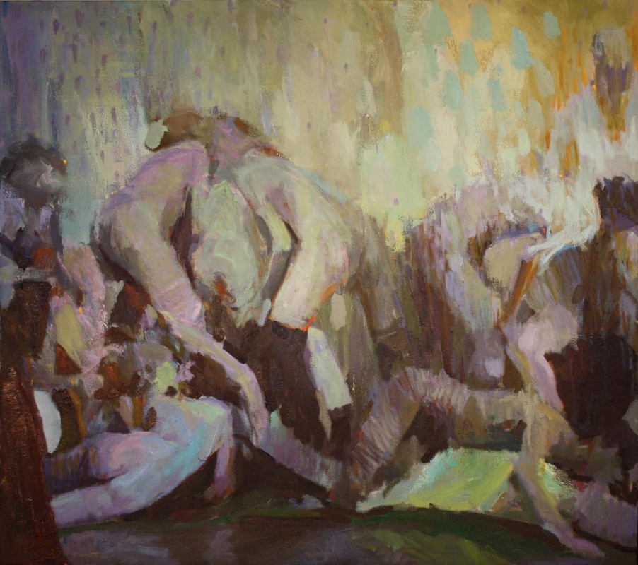
Tragic Comity: Prologue 
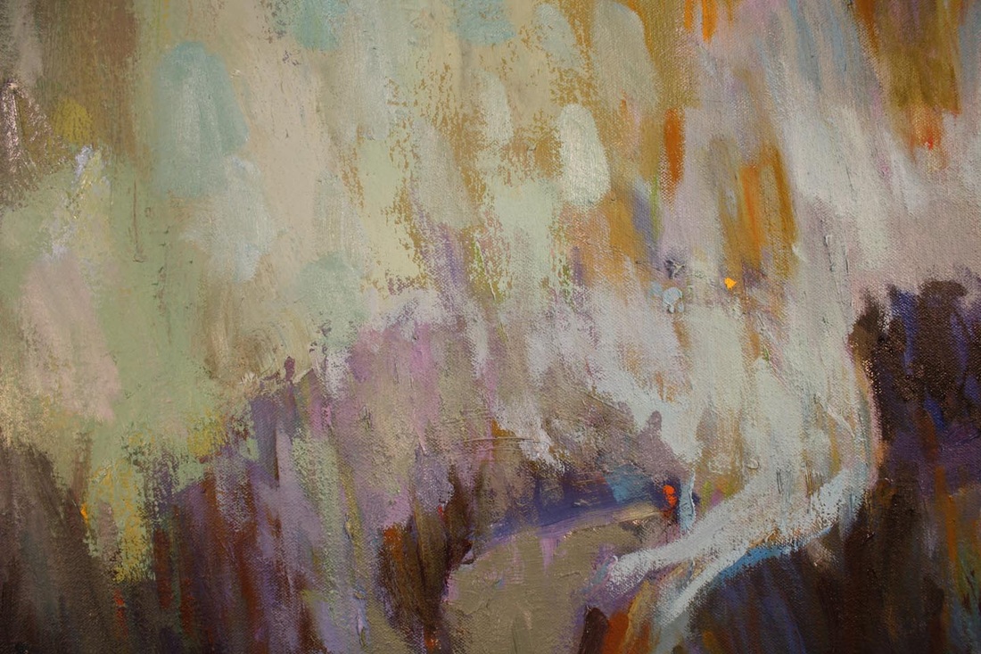
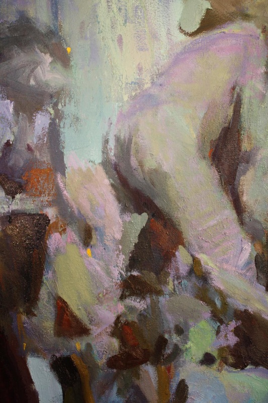
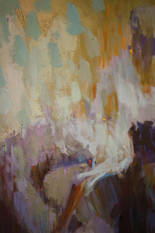
oil on canvas, 36"X32", in progress shot
From a new series, Tragic Comity, I've recently been working on. The images included are sourced from vintage photographs found online, recombined to create vignettes that are quasi- allegorical in nature. I'm interested in an ambiguity between life and the theater of life, between instincts and social mores and where they meet. The exploration is still quite new and the piece I've included is a very direct work by comparison to the sketches I've been producing, which I'm sorry I haven't included. I want to reserve all of my personal comments, descriptive or critical (of which I have many), so that this work itself may be viewed without a particular slant or bias. Any comments and criticisms, (formal, palette, thematic, etc.) are appreciated. I feel a bit stuck in some ways and feedback would be most helpful. Thanks.
ABOUT THE ARTIST: Michael Schmidt is an artist working out of Akron, Ohio. He received his BFA from the Cleveland Institute of Art in 2004 and his MFA from the California State University, Long Beach in 2013.
Hi Mike!
Firstly, thank you so much for being a guest artist to our site. It is such a pleasure and a privilege.
Your painting feels a bit Toulouse-Lautrec to me, which is interesting. His voyeurism and sketchy drawn figures doing intimate things is akin to what I'm experiencing in your painting.
It feels like the painter is separated from the activities going on during the making of the painting. I can't decide if it is a physical separation like a thin veil or curtain or if the painter is more emotionally detached. I suppose both can be happening.
I love the movement of the brushstrokes. The dappling of color and dissipated/fractured color is visually invigorating but it doesn't give the painting a directional light source which can also pose technical problems. Maybe part of your stagnance is drawn from that?
One thing about stages/theaters is the light source which is another reason why I brought that up. The composition is solid, but the top figures are somewhat fading into the background. Is that intentional?
It seems like a lot of your studies (I have looked at them a few weeks ago while snooping on your blog) are value-based and the value pattern was invented. It seems like the introduction of color is making it hard to deal with the value. I think revisiting the studies value will inform you where to go next. The composition and application of paint are both totally working.
I think the ideas driving this work are compelling and seem to yield a lot of creative exploration. Did you see this yet? It seemed related when I read it.
Also thank you for joining our little online studio!
When I first saw these images, it made me think of Odilon Redon. I feel like your work and his share a sketchy, dreamlike quality that is very compelling. When I think of this I know he also had a similar way with color. He made strictly black and white drawings for many years before opening up to color and then BAM!
I agree with Jamie that sometimes color can interfere with your patterns of light and dark which are key. Definitely return to your studies to try and analyze which elements need to be emphasized. It could be as simple as darkening up some edges a little.
I love the delicate modeling of the figures, the woman in the bottom left particularly. I think the use of that 'sickly green' is mesmerizing. It adds to the sense of un-ease that makes me want to investigate further.
Reply
Jacki G
8/27/2014 07:06:18 am
Mike,
Thanks for being one of our featured artists!
There’s definitely an clear eroticism masked by pastel palette. They’re definitely not your typical nudes. “Oviri” seems to come to mind, at the moment. Your warm-cool palette is very beautiful, but this painting is primarily value oriented. Those darks really break that Vuillard softness and make this more suggestive – violent and erotic. I think you can make your darks more distinctive in shape and let the light flicker as you do.
Actually, now that I think about it, the way you breakup your color with your marks does remind me of Toulouse Lautrec (as Jamie mentioned earlier). Perhaps, even the subject? Compositionally, you differ since your space seems to be shallower. It does feel like a shallow stage. Consider a change of depth. Shallower or deeper? Could pose new and interesting challenges. The composition seems a little bottom-heavy based on your value distribution. Something small on the lighter side to break up that bottom edge could bring more interest down there as well.
Let me know if you have questions - after all, this is a dialogue :]
Hello, Mike. Thank you so much for sharing your painting with us! This is my first introduction to your work, but I’m just going to dive right in…
Having done quite a lot of theatre myself, and had those experiences be highly influential in my own art making process it is fun to see a similar fascination, if very different exploration and interpretation of the theme.
Life vs Theatre of Life, I would love a little more insight into what your personal definition of these terms. Is it our personal lives versus the life that we appear to put on when everyone is watching? The stories that we concoct and project onto scenes that we see around us in the role of “audience” for the Theatre of Life? Though really, as I think on that, it is a less passive process than all that. You are not so much audience at that point, taking something in, but director interpreting a work and deciding how and what to show everyone else.
I know you wanted us to come into this without preconceived notions to get clean unbiased views, but I just seem to be coming up with a lot of questions. I have taken a look at your charcoal sketches…but do you do any sort of writing about the allegories that you wish to portray? Or reading where you are then selecting specific passages to turn bring to life in these vignettes?
Then I wanted to go over just a few notes on theatrical lighting. I don’t know how familiar you actually are with that as a process, whether it is something you’ve done or studied, or just a device that you are playing with in order to frame and portray these scenes. It looks as though we’re looking through a half lit scrim. (a piece of semi-sheer material that will often be used as a full curtain, can be painted like a scenic drop, when lit from the front it appears opaque, but when lit from behind it allows the action going on behind it to be seen with only the slightest shadow from the material) In your painting it looks as though it is dimly lit from both sides, allowing us to see the figures and their convoluted action, while at the same time blurring and obscuring them, almost a little reminiscent of the showcard posted advertising your Thesis Show. One of the things that the others have mentioned is the lack of a directional light source, and the issues where that is causing a lack of clarity and direction through the composition. It is very incongruous for me in this painting because any sort of theatrical scene is not going to have diffuse light, except through careful construction. You have to consciously fill in all the shadows using directional light sources.
I think a way for you to think about doing that but still play more within this pastel palette is to take a little more thought in making each COLOR directional. You almost do this with the muddy orange that is highlighting the edges of some of your shapes and figures. It appears to be coming from a source in the lower right corner of the scene. It’s also beginning to happen a bit with the red violet tone, which seems to be coming from the upper left, a bit to the rear, but then there are passages where it defies that spatial logic. (the elbow and lower thigh of the figure lying across the ground) While colors like the green, which I actually love for the visceral reaction it is giving me as it tinges flesh, don’t seem to have ANY logic to them coming from the front, and behind, and below...perhaps it is just a matter of going back to your studies, portraying there with value the different directions from which you want the colors to be coming from, and then coming back into your painting to clarify the piece.
Your interest in the ambiguity between life and the theater of life - I can’t help but put that into the contemporary context of our times, our generation. The way we present our lives, on a digital stage is very much composed and ambiguous in its reality. Thus I think the application of your brushstrokes perfectly suits the subject matter you are exploring. Your patchwork of color resembles digitized bits of data. The painting detail is simplified and pixelated in a way that is like hovering layers of color, or compressed data.
My notion of a vignette is a story told in an abbreviated way, much like a play accelerates real time, and contemporary depictions we put out there of ourselves only show the highlights. Yet ambiguity should scatter and diffuse a story. So you have a story, loosely based on the past from vintage photographs, that is diffused through your painting technique and made ambiguous. But it is clear that it’s set on a stage. It really makes me consider the meaning, and wonder why the story is diffused. What is the commentary here about the portrayal of stories? That the portrayal doesn’t accurately reflect the truth. In my round-about interpretation, and by being somewhat informed with the information given, I think this is very successful in exploring your subject matter. Taking it further would be to actively select the source photos to again reinforce your ideas. The purpose/rationale for using vintage photographs is not quite clear to me yet. I wonder what new depth could be brought into your work if your source materials were photographs you took from friends’ fb albums, family photos, or even just composed drawings of people you know. Just a thought.
As other have stated, your compositions are primarily value based. I wonder if keeping a limited palette will help you focus on color. I don’t think the light/color has to follow the logical direction as it would on an actual stage. The most important aspect of the stage is the drama of the scene, which your value shifts and composition accomplish. For the most part, the fact that the light sources are not logical, only adds to the idea of the ambiguous vignette. But perhaps focusing on that background color, ensuring it recedes from the figures instead of staying on the same plane would heighten the drama.
Tragic Comity - now that I’ve given an unbiased (but not truly) opinion, I am curious to what the theme “tragic comity “ means to you. I may add more on that after I've had a chance to mentally chew on it more.