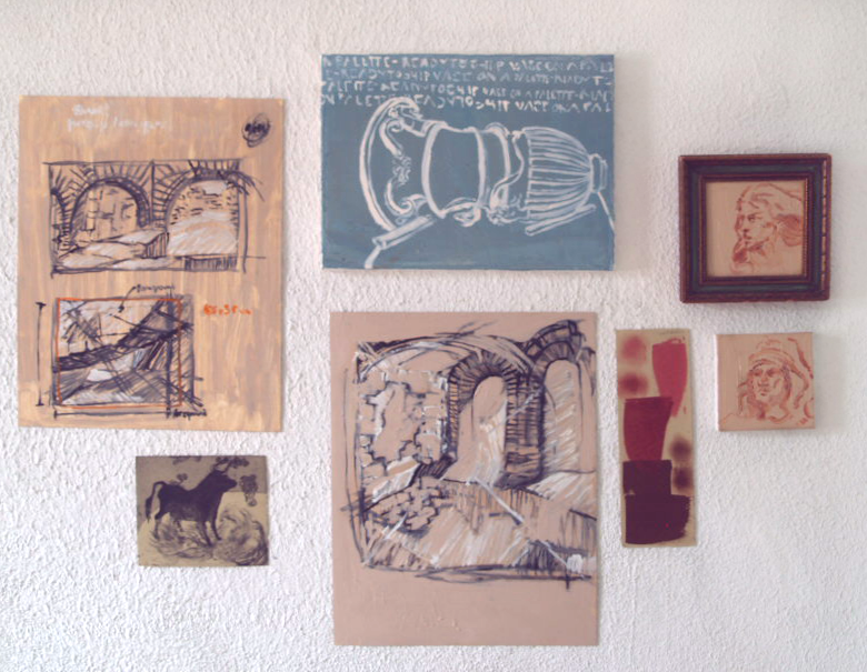
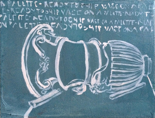
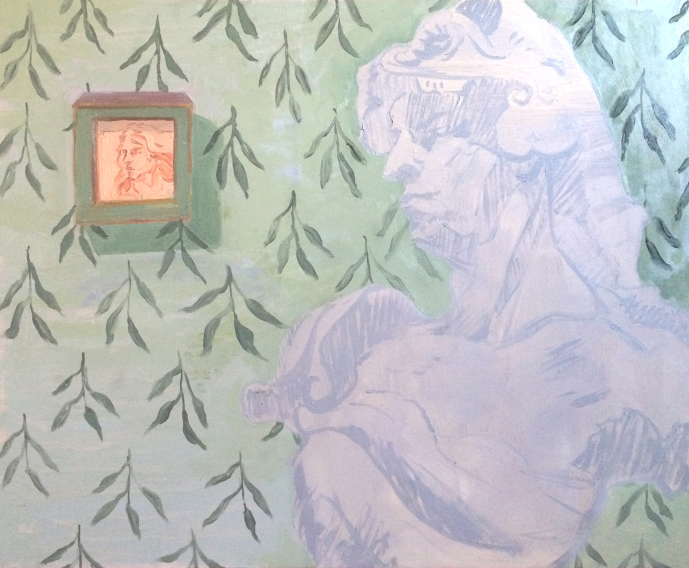
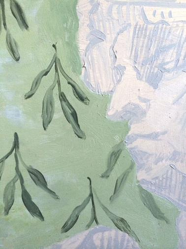
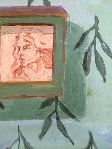
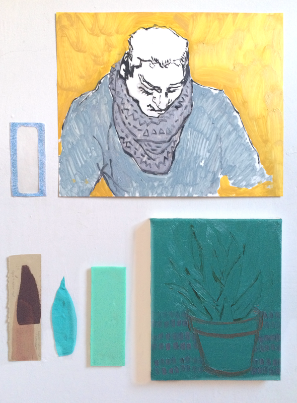
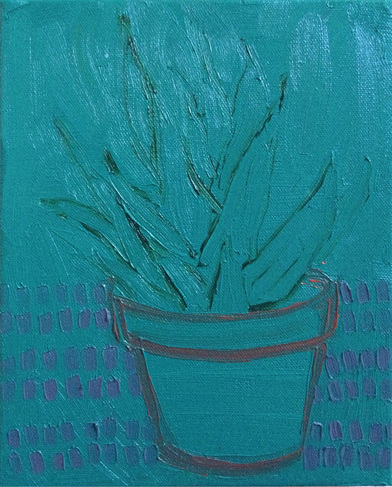
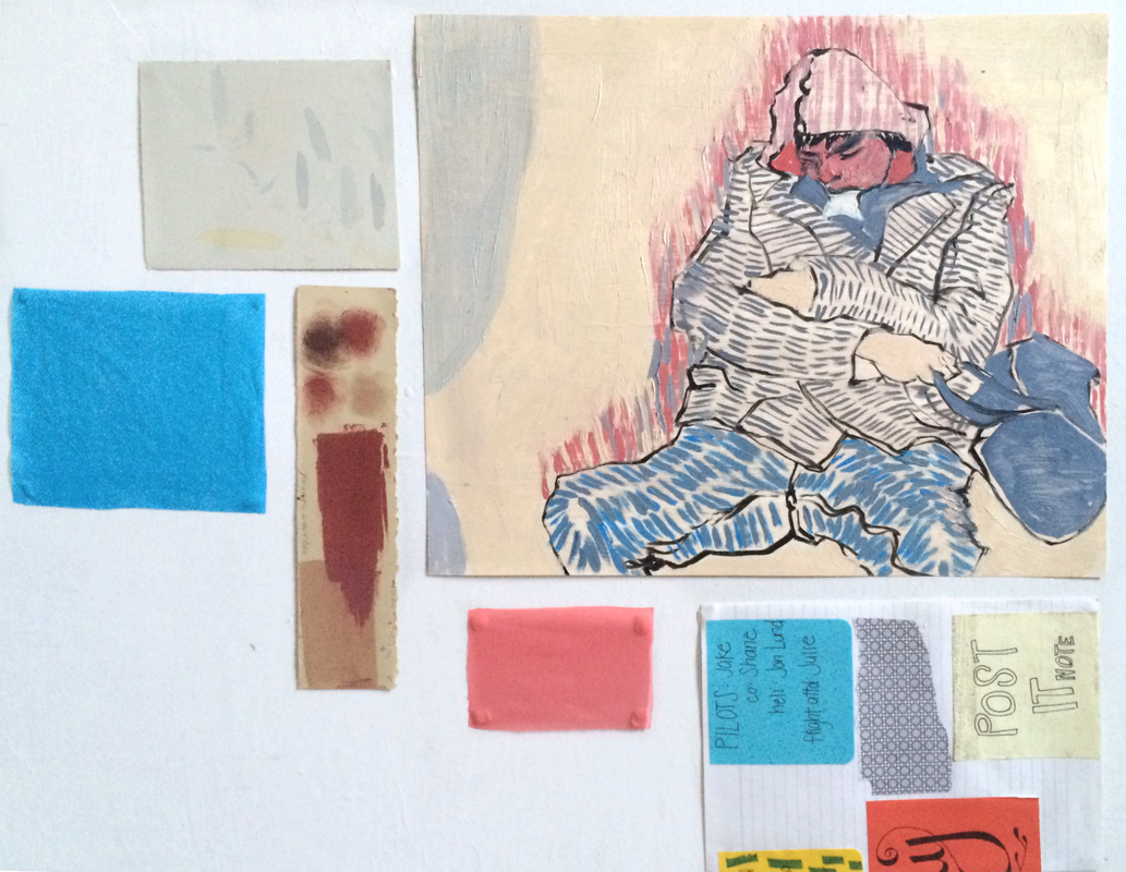
I finally have enough small draw-paintings to start bringing the old and the new pieces together!
I've been naturally grouping them mostly by palette or theme, which still helps me to work more freely with content's line and create patterns.
This is still a growing process so any feedback is welcome!
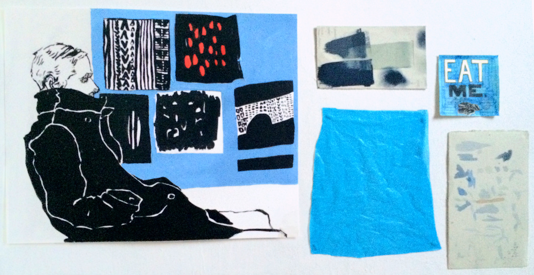
I've been naturally grouping them mostly by palette or theme, which still helps me to work more freely with content's line and create patterns.
This is still a growing process so any feedback is welcome!
 |  |
 |  |
 RSS Feed