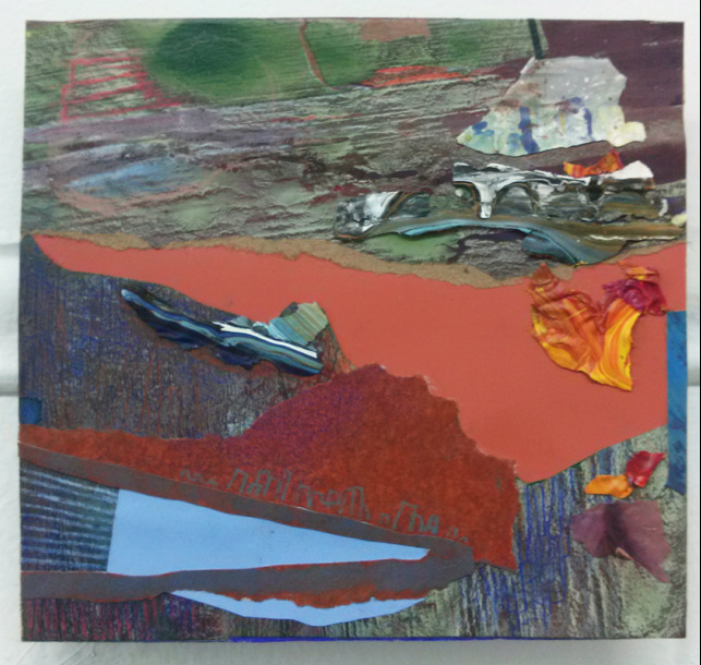
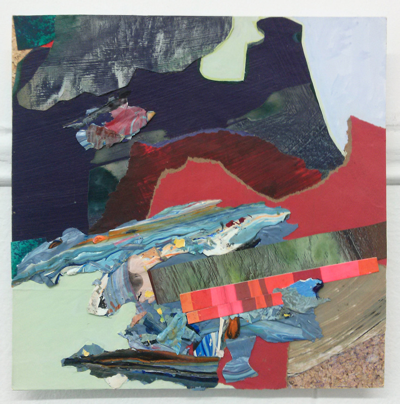
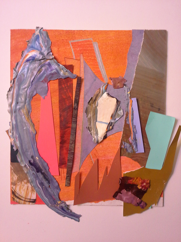
I thought my last pieces were small....nope not small enough. I have been working on several pieces with a maximum dimension of approximately 8 inches. Paint palette peelings l have saved since college in a worn out grocery bag were finally put to use. That, with the smallest leftover scraps from my large collages, plus some more prisma pencil.
Read more to see the rest!
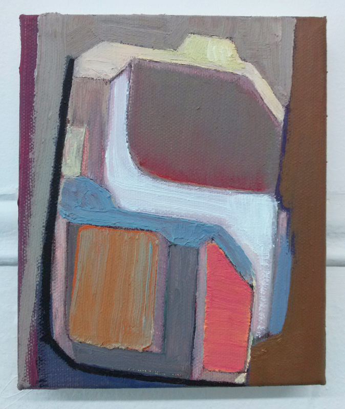
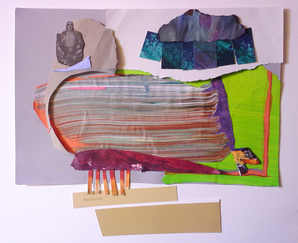
In addition to the header image which is a finished piece, here's four more I have been working on. Calling the first one finished, seconded could use tweaking, third a lot of tweaking, and the last is in the early stages. I do really enjoy the simplicity of the last piece, and I hope to not over complicate it with too much rework. Yes that is a Buddha image. I mostly like it for the actual color/value, but I think it's an interesting image. I guess they are in order of completion...Input on the last three especially would be appreciated. Sorry for the fuzzy pictures, I am still camera-less and these were taken by a cell phone.
Not much else to say on these. These are intuitive play.
Woohooo! These are SO awesome. It is so exciting to see those warm grays and strangely-wonderful abstract compositions in oil paint again.
(Can you tell that's me fave?)
Budda is so weird and I dig it. It reminds me of something I have seen in Marin county at an intuitive art show. Good stuff.
The first piece is truly beautiful...A lot going on in such a tiny piece!
Did you first choose palette shavings and build around it or vice versa?
The orange (3rd for clarification) has a lot of dynamic moments, but I am not sure the major shapes are working together. Some (not all) of the brown jagged paper is fighting with your purple tsunami.
The white bit in the middle might be better as a different color other than white.
I love you and am super proud of your playfulness!! : 0
Reply
Sherwood
6/18/2014 07:22:03 am
Hiya Cece!
So the more I look at it the more I really do love that oil painting. It's very sensitive and luminous. It reminds me a little of the work that Jonathan Apgar was doing his last year at school with the modular shapes.
But I do think my favorite is the Buddha one. I am really excited by how you are opening up the space and playing around with staggering and repeating shapes. I am wondering if you started collaging on a transparent surface like duralar? That may help you keep everything glued and connected but explore the extra space a bit. I kind of see this as a small beginning into collage/painting/installation world.
I agree with Jamie that the 'Purple Tsunami" one needs some unification, possibly push the colored pencil marks more? I think it's interesting to see you respond to the collage elements in that media. It's like having a conversation with yourself.
Which, oddly enough was some good advice from another artist on how to write an artist statement. "You have to sit down and interview yourself."
-Steph
Reply
Jacki G
6/19/2014 01:39:53 am
LOVE the Buddha one! There's something so narrative about it, and it's not the Buddha (although it totally works). I think it's the way your shapes are composed, repeated, et al. It starts to remind me of the ways interior/exterior pictures are composed. Do you have specific references that you think about beforehand or as you construct them, if at all? I always tend to feel a sense of landscape in your collages, but maybe I tend to look for them. I don't know. But, you're right about the simplicity. I think sometimes simplicity becomes so attractive.
I think this playing at being artists is working out for all of us. ;)
Love the finished pieces, so I'm going to try and address the in progress ones instead.
The oil painting maybe be and oddball, but it is definitely going somewhere. That orange rectangle overlaid with that blue is probably my favorite part...so drawn to it. It's the edges of your shapes though...those places where you've covered all but the thinnest part in another color, usually muting the larger shape. It makes them vibrate in place. They are electric, and little Rothko-esque. That's what I feel is activating the whole space. And it's something that you haven't necessarily had in recent pieces because the house paint and acrylic creates such solid color. This dip back into oils opens up different possibilities.
The Tsunami collage I feel does need something more to pull it together. That jagged red brown paper piece is distracting for me. I think that's a good passage to try and work in a strong horizontal movement, but those spikes try to make it vertical again, and it seems to lose any power it has in either direction.
And lastly, Buddha is so playful! But definitely don't overwork it. I know you were saying that the addition of the figure was more just a matter of color/value/shape for the composition, but the combination of that, the look of water coming in on shore, the little raincloud formation, and inclusion of the text Beachwalk from the paint chip definitely starts building a little bit of a narrative, or at least a bit of a meditation in my mind.
Also, I'm not sure if it's just an effect of the cell phone pictures, not having a decent white balance, but on a couple of them it looks as though they are on a very subtle larger color field. I like the idea of working the collages on duralar so that you can create space for these elements that are starting to detach themselves from the main collage, but maybe just larger encompassing rectangles with a subtle wash of color would work for that as well. Give you back a more frame-able traditional rectangle, but still allow you to experiment with your radical edges.